|
 |
|
 |
|
| Author |
Message |
SKIN JOB 66
Community Member

Joined: 16 Jan 2008
Posts: 2724
Location: FRANCE
|
 Posted: Sun Mar 09, 2008 9:41 am Post subject: BLADE RUNNER LOGO DESIGN Posted: Sun Mar 09, 2008 9:41 am Post subject: BLADE RUNNER LOGO DESIGN |
 |
|
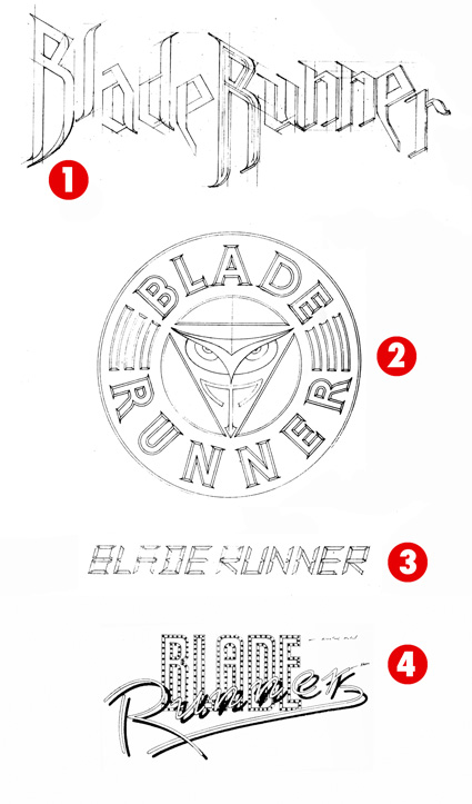
I've found track of a few BLADE RUNNER logo layouts in a typography book I had for years... The name of the designer is Jay Vigon (He designed a lot of stuff in the 80s and 90s, from "The Empire strikes back" movie logo to the "Gotcha" brand, plus numerous logos for rock bands, etc...)
I've numbered the logos, this way it'll be easier for everybody to comment...

It looks like logo 1 was the main influence/prototype for the TYRELL PATCH that was issued in 1982...
I especially like logo 1, it would be very cool on a t-shirt !!!

There's a short note aside the logos that says :
Blade runner
Movie title treatment
These were preliminary sketches for a main title treatment of a science fiction movie. Many of these designs were influenced by the art direction of the movie's sets.
Client : Blade Runner inc. / The Ladd Company
Other infos I can add :
Title of the book : MARKS
Author : Jay Vigon
Published by Graphic-Sha (Japan) in 1986
The logos appear on pages 200 and 201.

_________________
THE FUTURE IS A THING OF THE PAST
Last edited by SKIN JOB 66 on Tue Mar 18, 2008 9:43 am; edited 3 times in total |
|
| Back to top |
|
|
|
|
 |
|
 |
|
|
|
|
| Author |
Message |
SKIN JOB 66
Community Member
Joined: 16 Jan 2008
Posts: 2724
Location: FRANCE
|
| Posted: Sun Mar 09, 2008 11:01 am Post subject: |
|
|
Sorry, I meant LOGO 2 looks like the main influence for the official TYRELL PATCH...
_________________
THE FUTURE IS A THING OF THE PAST
Last edited by SKIN JOB 66 on Fri Mar 14, 2008 6:16 pm; edited 1 time in total |
|
| Back to top |
|
|
|
|
|
|
|
|
|
|
|
| Author |
Message |
andy
Community Guide

Joined: 01 Nov 2006
Posts: 6237
Location: Rochester, NY
|
| Posted: Sun Mar 09, 2008 1:48 pm Post subject: |
|
|
I wonder if the Tyrell Owl logo came first, or if this version did. He may have been influenced by Tom Southwell's work since the owl was actually seen on Tyrell's robe in the movie. Cool stuff and great addition to BR history that I had never heard of before. Thank you very much.
Andy |
|
| Back to top |
|
|
|
|
|
|
|
|
|
|
|
| Author |
Message |
SKIN JOB 66
Community Member
Joined: 16 Jan 2008
Posts: 2724
Location: FRANCE
|
| Posted: Sun Mar 09, 2008 5:04 pm Post subject: |
|
|
Thanks a lot for your post, Andy.
Didn't know the owl was a design by Tom Southwell, and that it appeared on Tyrell's robe !!!

Usually, logo design is part of the marketing plans (along with the poster), it's created "shortly" (by production time) before the release of a movie, so I guess you're right, Vigon might have taken inspiration from a Southwell creation... and maybe inspired the Tyrell patch design to another graphic designer !
_________________
THE FUTURE IS A THING OF THE PAST
Last edited by SKIN JOB 66 on Sat Mar 02, 2013 4:42 am; edited 1 time in total |
|
| Back to top |
|
|
|
|
|
|
|
|
|
|
|
| Author |
Message |
SKIN JOB 66
Community Member
Joined: 16 Jan 2008
Posts: 2724
Location: FRANCE
|
| Posted: Tue Mar 11, 2008 8:42 am Post subject: |
|
|
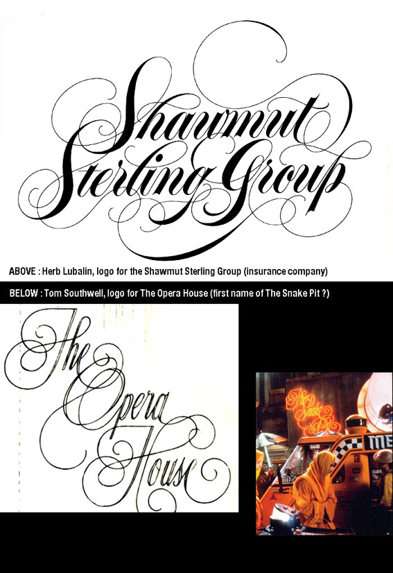
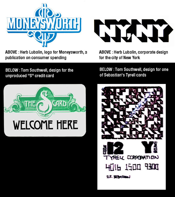
Here is something else about BR graphic design... It's always been obvious to me that Tom Southwell took some inspiration from the works of Herb Lubalin for some of his BR logos ...
Herb Lubalin (1918-1981) was the main typographer / Graphic designer / Art director of his time. He produced a lot of masterpieces from the early 60's to late 70's. He was THE graphic design Master when BR was in production...
Go check here for more info on him and his brilliant career :
http://www.typogabor.com/herb-lubalin/
(this site is also devoted to the works of Paul Gabor, a brilliant graphic designer who was also one of my teachers in Artschool)
I don't want to depreciate Tom Southwell's work on BR (I'm a huge fan), just underscore that this film was also a product of its time...
Take a look at the images below, you'll understrand what I mean :
_________________
THE FUTURE IS A THING OF THE PAST
Last edited by SKIN JOB 66 on Sat Mar 02, 2013 4:43 am; edited 5 times in total |
|
| Back to top |
|
|
|
|
|
|
|
|
|
|
|
| Author |
Message |
repdetect
Community Member
Joined: 19 Mar 2007
Posts: 268
Location: FRANCE
|
| Posted: Tue Mar 11, 2008 3:12 pm Post subject: |
|
|
| Hey Fred !!...great find and great site too ! |
|
| Back to top |
|
|
|
|
|
|
|
|
|
|
|
| Author |
Message |
SKIN JOB 66
Community Member
Joined: 16 Jan 2008
Posts: 2724
Location: FRANCE
|
| Posted: Tue Mar 11, 2008 7:23 pm Post subject: |
|
|
Thanks a lot, Phil !
If you liked the former link, you'll like this new one as well... It's about Saul Bass, one of Herb Lubalin's friends, and a master in his own field : opening credits. He worked on films such as Vertigo, Anatomy of a murder, West side Story, The Man with the Golden arm, The Age of innocence (this one was his last before he died), etc... and you can also download this very interesting documentary on your PSP or iPod...
ENJOY !!!
http://video.google.fr/videoplay?docid=-1343063261314199679&q=bass+on+titles&total=2296&start=0&num=10&so=0&type=search&plindex=0
_________________
THE FUTURE IS A THING OF THE PAST
Last edited by SKIN JOB 66 on Sat Mar 02, 2013 4:45 am; edited 2 times in total |
|
| Back to top |
|
|
|
|
|
|
|
|
|
|
|
| Author |
Message |
aerodyne
Community Member
Joined: 29 Jan 2008
Posts: 26
Location: UK
|
| Posted: Wed Mar 12, 2008 12:04 pm Post subject: |
|
|
Very interesting! Details like this surface occasionally, but it just serves to make me wish all the more that there was a proper BR design / making of book. 
P. |
|
| Back to top |
|
|
|
|
|
|
|
|
|
|
|
| Author |
Message |
repdetect
Community Member
Joined: 19 Mar 2007
Posts: 268
Location: FRANCE
|
| Posted: Wed Mar 12, 2008 7:37 pm Post subject: |
|
|
Hey Fred !
Thanks for the link, i always loved Saul Bass's work and personaly own most of the movies you talked about !...I will add Cape Fear, scorsese's remake of course, and THAT music !!!
Phil |
|
| Back to top |
|
|
|
|
|
|
|
|
|
|
|
| Author |
Message |
andy
Community Guide
Joined: 01 Nov 2006
Posts: 6237
Location: Rochester, NY
|
| Posted: Wed Mar 12, 2008 8:57 pm Post subject: |
|
|
I like Saul Bass as well and thought his movie 'Phase IV' was pretty cool as well. At least I think it was his  |
|
| Back to top |
|
|
|
|
|
|
|
|
|
|
|
| Author |
Message |
SKIN JOB 66
Community Member
Joined: 16 Jan 2008
Posts: 2724
Location: FRANCE
|
| Posted: Thu Mar 13, 2008 2:54 am Post subject: |
|
|
Saul Bass is also responsible for the conception and editing of the famous "shower scene" in Psycho... (He worked on Vertigo, too)
_________________
THE FUTURE IS A THING OF THE PAST |
|
| Back to top |
|
|
|
|
|
|
|
|
|
|
|
| Author |
Message |
SKIN JOB 66
Community Member
Joined: 16 Jan 2008
Posts: 2724
Location: FRANCE
|
| Posted: Thu Mar 13, 2008 5:42 pm Post subject: |
|
|
Thanks for your posts, guys !
Regarding the magazines created for the movie, the MONI issue refers directly through its title to OMNI, a Science-Fiction mag, we (almost) all noticed that.
BUT I think the cover also refers to the general spirit of the famous (among architecture and interior design amateurs) DOMUS magazine. Taschen recently re-published a vast collection of past issues... (Very interesting but very expensive, 1000€ if I remember well the price of the one I saw at my local bookstore)

_________________
THE FUTURE IS A THING OF THE PAST |
|
| Back to top |
|
|
|
|
|
|
|
|
|
|
|
| Author |
Message |
jfuste
Community Member

Joined: 31 Dec 2007
Posts: 739
Location: Barcelona, Spain
|
| Posted: Fri Mar 14, 2008 1:55 pm Post subject: |
|
|
What a nice reference material!!!! AS EVER!

_________________
 |
|
| Back to top |
|
|
|
|
|
|
|
|
|
|
|
| Author |
Message |
SKIN JOB 66
Community Member
Joined: 16 Jan 2008
Posts: 2724
Location: FRANCE
|
| Posted: Fri Mar 14, 2008 6:12 pm Post subject: |
|
|
As Tom Southwell explains in the very interesting "Signs of the times" documentary on the BR Director's cut DVD edition, Ridley Scott asked him to pick ideas in native americans' art.
Here is what I've found...
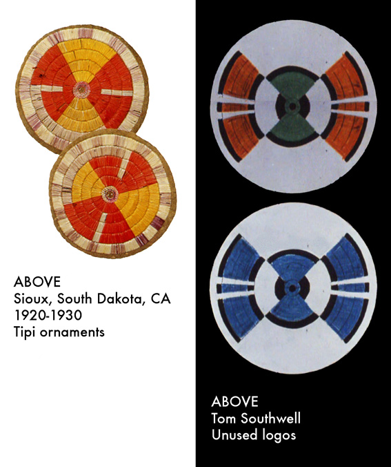
I also made a very interesting discovery... A tiny owl figure !
I now wonder if Tom Southwell took inspiration in it (or similar objects such as "owl pipes") for Tyrell's owl emblem...
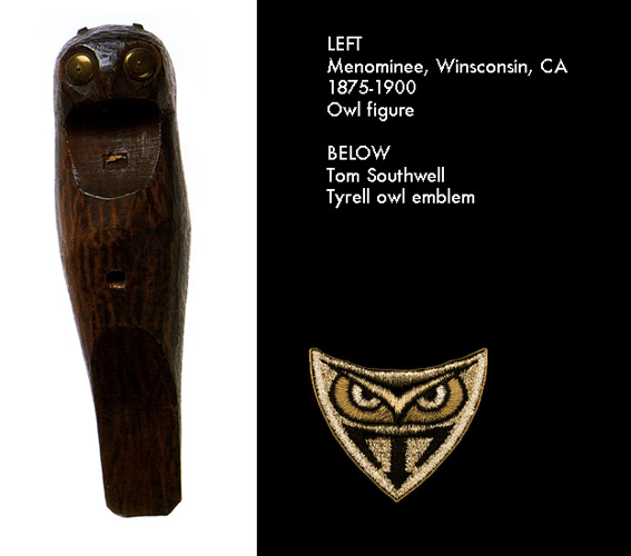
Here is a short note, related to the above owl figure, that I found very interesting to (maybe) explain the "Tyrell's owl emblem" idea :
"In their views of the spiritual and physical world, the tribes use symbols freely to enrich their daily lives and ceremonies.
The symbols serve as either protection or as reminders of the living universe, bridging the gap between the spiritual and physical realms."
(The Spirit of Native America - Anna Lee Walters - Chronicle books, 1989)
When you realize that Tyrell is like a God among humans (he has created life and lives on top of a pyramid-like skyscraper) and is surrounded by protection devices (remember Sebastian & Batty in the elevator)...
When you also realize that the extinction of living forms such as owls surely is the fault of economical superpowers such as the Tyrell Corporation (it already started in OUR world), it suddenly makes sense, don't you think ?
_________________
THE FUTURE IS A THING OF THE PAST |
|
| Back to top |
|
|
|
|
|
|
|
|
|
|
|
| Author |
Message |
SKIN JOB 66
Community Member
Joined: 16 Jan 2008
Posts: 2724
Location: FRANCE
|
| Posted: Sat Mar 15, 2008 5:28 am Post subject: |
|
|
Andy wrote :
| Quote: | | He may have been influenced by Tom Southwell's work since the owl was actually seen on Tyrell's robe in the movie. |
Here is a pic of the robe. The owl logo only appears in this scene, when Tyrell starts to argue with Batty... Thanks again for the info, Andy !
.png)
_________________
THE FUTURE IS A THING OF THE PAST |
|
| Back to top |
|
|
|
|
|
|
|
|
|
|
|
| Author |
Message |
andy
Community Guide
Joined: 01 Nov 2006
Posts: 6237
Location: Rochester, NY
|
| Posted: Sat Mar 15, 2008 1:15 pm Post subject: |
|
|
I think I remember reading they were on his slippers too, but of course they weren't shown.
The robe does seem to be the only place the logo was seen in the movie. Still not sure who designed it. Spinner44.com has had contact with Tom Southwell, so maybe he could shed some light on it.
The owner of the robe can be seen on the DVD set and on his website Shapestorm.com. He may be a member here too.
Andy |
|
| Back to top |
|
|
|
|
|
|
|
|
|
|
|
| Author |
Message |
repdetect
Community Member
Joined: 19 Mar 2007
Posts: 268
Location: FRANCE
|
| Posted: Sat Mar 15, 2008 3:02 pm Post subject: |
|
|
Awesome work of research SKIN JOB 66 !!!....  |
|
| Back to top |
|
|
|
|
|
|
|
|
|
|
|
| Author |
Message |
SKIN JOB 66
Community Member
Joined: 16 Jan 2008
Posts: 2724
Location: FRANCE
|
| Posted: Sat Mar 15, 2008 3:39 pm Post subject: |
|
|
| Quote: | | What a nice reference material!!!! |
Thanks a lot for your enthusiasm, Joan !

| Quote: | | Spinner44.com has had contact with Tom Southwell, so maybe he could shed some light on it. |
I would definitely be really interested in getting Tom Southwell's version on the owl logo origin !!!
| Quote: | | Awesome work of research SKIN JOB 66 !!!.. |
Well, I must admit I have some books at home that fit the subject... No hard research, just trying to grab the right books off my shelves !
Coming next : 3rd Reich emblems used as reference for the Tyrell "T" logo... Stay tuned !
_________________
THE FUTURE IS A THING OF THE PAST |
|
| Back to top |
|
|
|
|
|
|
|
|
|
|
|
| Author |
Message |
SKIN JOB 66
Community Member
Joined: 16 Jan 2008
Posts: 2724
Location: FRANCE
|
| Posted: Tue Mar 18, 2008 7:55 am Post subject: |
|
|
Regarding the 3rd Reich emblems used as inspiration for BR graphic design, here is what I've found...
I've concentrated on the Tyrell "T" logo here. (not on the cops who are obviously Nazi in their general uniform and patches design)
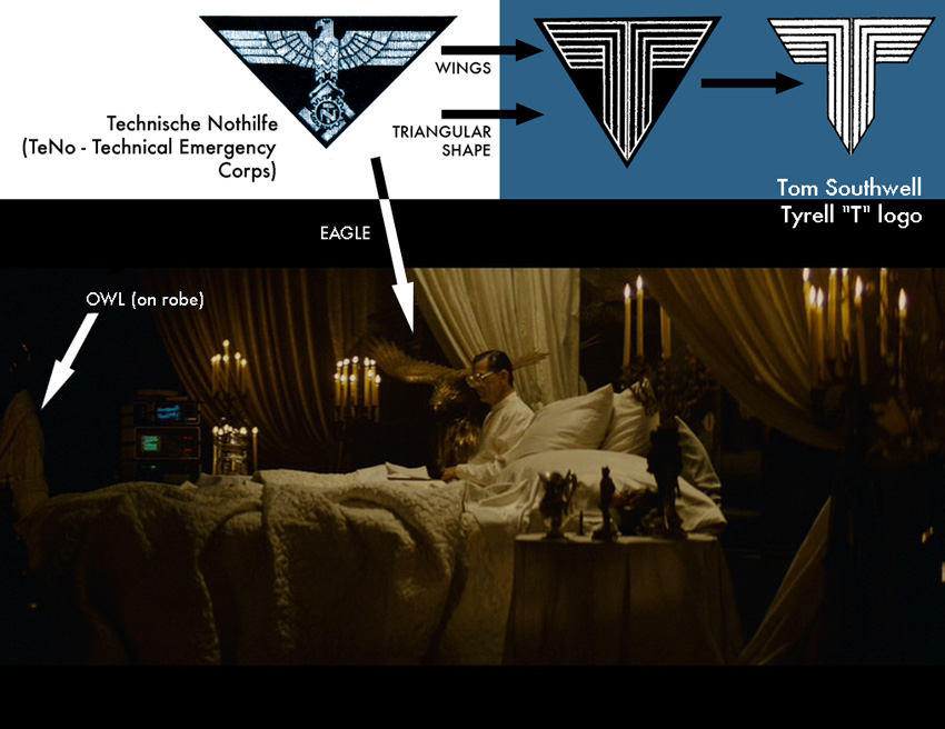
The interesting thing here is that you can actualy see an eagle in the above scene.
The eagle was a central image in German 3rd Reich state symbolism (same thing for the Napoleonic French era), a symbol of strength and domination... While Tyrell sells stock-options, the eagle seems to be whispering advices (or orders ?) to Tyrell's ears from this dark area aside the bed / Throne... The eagle (standing on a globe ?) is aside him, which means they're both on the same side... the side of very powerful people.
I'm sure the general idea here was to show that Tyrell is a kind of "economical Tyrant" (Tyrant + Hell = Tyrell ???) who fights an economical war.
(I also think the idea refers more to Napoleon than Hitler, because of the non art-deco eagle and ALSO the candles that remind the general mood of some scenes from THE DUELLISTS, Ridley Scott's first film) (or BARRY LYNDON, of course !)
We can also see the "owl robe" on the far left of the image... I think it definitely represents the other side of Tyrell's personality, the "benevolent God" side. Tyrell will leave his "economical Tyrant" bed / throne to put this robe on and suddenly become a kind person who takes time to play chess with one of his employees, even if it's late.
Later, he will welcome Batty in the same garb. He'll look a little bit afraid by this unexpected visit BUT won't call for help. He will listen and try to comfort Batty instead, like a father would do with the prodigal son. (or a God would with an Angel ? I say that because, when Batty leaves Tyrell's building in the elevator, he looks like an Angel falling from the stars... and it makes sense, since he's supposed to be the bad, evil guy !)

_________________
THE FUTURE IS A THING OF THE PAST |
|
| Back to top |
|
|
|
|
|
|
|
|
|
|
|
| Author |
Message |
repdetect
Community Member
Joined: 19 Mar 2007
Posts: 268
Location: FRANCE
|
| Posted: Tue Mar 18, 2008 12:29 pm Post subject: |
|
|
| Now your analysis is more and more outstanding !!!!!...congrats Fred ! |
|
| Back to top |
|
|
|
|
|
|
|
|
|
|
|
|
You cannot post new topics in this forum
You cannot reply to topics in this forum
You cannot edit your posts in this forum
You cannot delete your posts in this forum
You cannot vote in polls in this forum
|
|
|
|
|
|
|
|