|
 |
|
 |
|
| Author |
Message |
Replicant 13
Community Member

Joined: 18 Jul 2011
Posts: 912
Location: OffWorld Park, USNA
|
 Posted: Sun Aug 21, 2011 2:37 pm Post subject: PAPER PROPS - The Magazines Reimagined Posted: Sun Aug 21, 2011 2:37 pm Post subject: PAPER PROPS - The Magazines Reimagined |
 |
|
AN INTRODUCTION
Having been a fan of Blade Runner since its release in '82, I have visited PropSummit often, but only recently joined.
Although I KNOW I have seen other discussions regarding the work of Tom Southwell and in particular the reproduction of his various magazine covers, upon searching I found nothing investigating the details of these designs or their background. There seems to be little information on this topic, even on the recent release of the 5-disc set.
With that, it was my thought to open a discussion, if there's any current interest, regarding the various aspects of these designs.
---
As an illustrator and designer since the late 70's, I am aware of the limitations faced by Southwell and crew when creating the various background elements of BR. I know how things were done back then (before the impact of the Mac), and knew how things could be approached now, from both directions. With the considerable connections apparent on PropSummit, it is my hope that some of my assumptions can be verified or corrected here, should others feel willing to do so.  As my contribution, I can only offer what I have found, or assume to be correct. As my contribution, I can only offer what I have found, or assume to be correct.
Over the past decade or so - with more information available here and elsewhere on the net - it has become considerably easier to find reference (albeit of varying quality). I am aware of the efforts of several to reproduce these covers, selling them on eBay, or making them openly available here. Some have been amazingly accurate. Others, not so much.
I hope to combine my research with a new approach. When I decided to take up the challenge myself over the past decade, I started initially with the goal of augmenting my own BR collection. At the time I only wanted to improve on the re-creations offered, with my own attempts to correct fonts or improve on other elements with retouched scans, etc. Like others, I tried to duplicate Southwell's original creations as accurately as possible.
Relying on various sources, after having re-created a couple, I discovered some variances in the reference I found. I decided to start over, with more investigation up front.
There seemed to be several points still needing clarification -
TYPOGRAPHY
As a designer, I found font design and the hunt for the "correct" typeface interesting, in part due to the history and the changes brought about by digital technology.
I do not criticize the efforts of those who have tackled this quest before me. I know from experience how difficult it can be (even today) to match a certain typeface.
I would assume that some of the comps Southwell and others created for BR used dry-transfer type, prevalent at the time. And as many type foundries create variants of known font families (due in part to licensing issues) this added to the mystery. Jump ahead to the transition to digital and the field only widens.
- As an example, when recreating the cover for DROID, I found it difficult to find an exact match for the font used in the subhead. I was determined to find it and while I found an exact match in an old Typeface catalog - circa 1985, nothing available online matched - exactly. With all the similar faces and variations, after some research I settled on ITC Ronda, but even so, there were some obvious differences - in particular, the cap M. It was only after further research that I stumbled upon an article explaining that when this font was translated to a digital form, certain alternate letters were dropped - like the "M".
ART
It appears that the illustrations used for these covers was a mixture of drawings produced by Southwell, and clipart available at that time. Most of these have been copied from online sources for re-creations, with mixed results.
- I tried in vain to locate a source for the original illustration of the "fat man" on the cover of DORGON. After spending considerable time scouring a couple of online catalogs of vintage clipart, I found a few line illustrations of a very similar style. Assuming they might have been done by the same artist, my further investigation lead to a dead end, with no help from a stock rep.
At this point I decided a more efficient approach would be to re-illustrate it as faithfully as possible, in color and texture, as well as style. My solution may be lacking accuracy (due to the poor source image), but it has the benefit of higher resolution and "feet" (see below).
COLOR
Some of the images available online were taken from earlier sources like the CINEFANTASTIQUE article by Paul M. Sammon. Depending on how these were lit when photographed back in 1981/82, as a source the image quality has always been lacking and they were quite small. When used in the various re-creations over the years, any enlargement has only distorted these issues further. In particular the background and mechanical contrivance featured on the cover of DROID appears discolored/faded, affected by a strong light source in the lower left corner. I think this, paired with apparent film grain and halftone screens, has hampered any effort to faithfully reproduce this cover. And the true color remains a guess on many of these covers, and still left to creative license.
- Like those before me, I have given it my best guess and tried to add in more vibrant colors and some textures for subtle detail.
---
All said, rather than re-create these covers in an attempt to match them dead-on, I decided to rework and update their look, with more detail, correct spellings and cleaner type, and re-created graphics and illustrations, while remaining as loyal as possible to internal relationships/proportions and content and overall color scheme. I am nearing completion.
ADS
And as many have already found, a magazine naturally requires a corresponding back cover - an ad to complete the look. So I have created those as well, based on props and objects from the book, as well as the film. I hope to share those here in the near future.
.jpg)
Have a better one! - R13
_________________
.png) Gosh, you've really got some nice toys here . . . Gosh, you've really got some nice toys here . . .
Last edited by Replicant 13 on Sat May 02, 2020 1:26 am; edited 27 times in total |
|
| Back to top |
|
|
|
|
 |
|
 |
|
|
|
|
| Author |
Message |
joberg
Community Member
.jpg)
Joined: 06 Oct 2008
Posts: 9447
|
| Posted: Mon Aug 22, 2011 7:49 am Post subject: |
|
|
Excellent research so far Replicant 13. When you think of it, those mags were never intended to be heros in the movie and despite that fact, were well put together for the time. I'm slightly interested in those for the fact that my Father was a graphic artist for more than 35 years and, as a child I remember the stories about putting an advert page together using negs, and Letraset or other kinds of dry lettering. Quite a task for our generation of computer programs when a click is all it takes to produce something at a pro-level.
The fat boy reminds me of the drawing style seen in the Monty Python skits...maybe that's a road to explore?
Good luck with the project  |
|
| Back to top |
|
|
|
|
|
|
|
|
|
|
|
| Author |
Message |
Replicant 13
Community Member
Joined: 18 Jul 2011
Posts: 912
Location: OffWorld Park, USNA
|
| Posted: Mon Aug 22, 2011 11:17 am Post subject: |
|
|
Thanks joberg.
As I said, having started out in the field in the late 70's, like many of you may have, I remember the days of pen and pencil, marker and spraymount and cutting amberlith or rubylith for overlays. But I was one of the first in my group to embrace the Mac.
As you hinted, many of the ADs I have dealt with lack the skills of previous generations. Perhaps understandable today, in this face-paced world. But were it not for Google and stock (and the occasional illustrator) many would be sunk.
Not that there's not a wealth of talent out there, it just has different disciplines and moved into other areas. Art takes time, and time is money.
---
I suspect that the clipart (fat boy) IS from that same artist, or a very similar source. There are volumes out there. As yet, I've not found it. But I came close in style with this:
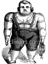
While it resembles art used by Gilliam for MP, no doubt he altered his discoveries, as perhaps Southwell did. It is my hope that with the connections here, someone might recognize it, or have a source.
As always - Have a better one. - R13
_________________
Gosh, you've really got some nice toys here . . .
Last edited by Replicant 13 on Fri May 13, 2016 9:53 pm; edited 3 times in total |
|
| Back to top |
|
|
|
|
|
|
|
|
|
|
|
| Author |
Message |
SKIN JOB 66
Community Member

Joined: 16 Jan 2008
Posts: 2724
Location: FRANCE
|
| Posted: Mon Aug 22, 2011 2:54 pm Post subject: |
|
|
Welcome Rep13 !
I don't know if this could help or not, but this illustration looks a lot like it was drawn after Rabelais' GARGANTUA novel. It was mainly illustrated by Gustave Doré but I don't know who's the artist behind the illustration you posted, sorry...
BTW, take a look at this, I'm sure you'll find some of the info posted in this thread rather interesting :
http://www.propsummit.com/viewtopic.php?t=774
Cheers !
Fred
_________________
THE FUTURE IS A THING OF THE PAST |
|
| Back to top |
|
|
|
|
|
|
|
|
|
|
|
| Author |
Message |
Replicant 13
Community Member
Joined: 18 Jul 2011
Posts: 912
Location: OffWorld Park, USNA
|
| Posted: Mon Aug 22, 2011 8:25 pm Post subject: |
|
|
Hello 66! Good to hear from a fellow skinjob.
Thanks for the info. In my search for the DORGON FatBoy, I found the image I posted, but when I contacted the site, clipart.com, they told that they had no information on the illustrator - just that it was vintage. I couldn't quite make out the signature and didn't want to buy a stock image that I had no intention of using.
Thanks for the lead and the link. I appreciate it!
Of course, should I find anything, I will definitely post it here.
HAB1- R13
_________________
Gosh, you've really got some nice toys here . . .
Last edited by Replicant 13 on Sun Aug 28, 2011 12:44 pm; edited 1 time in total |
|
| Back to top |
|
|
|
|
|
|
|
|
|
|
|
| Author |
Message |
Replicant 13
Community Member
Joined: 18 Jul 2011
Posts: 912
Location: OffWorld Park, USNA
|
| Posted: Mon Aug 22, 2011 8:44 pm Post subject: |
|
|
66 -
Just accessed the link. Very cool. I am amazed at the things/information available on PropSummit, if you know where to look. So much to see, so little time. : )
From the 80's I was aware of Lubalin (initially for his font design) and I was always a big fan of Saul Bass, especially his classic movie poster designs and title work. Both giants. Very interesting stuff. I will have to give it a thorough read.
Thanks again. - R13
_________________
Gosh, you've really got some nice toys here . . . |
|
| Back to top |
|
|
|
|
|
|
|
|
|
|
|
| Author |
Message |
Replicant 13
Community Member
Joined: 18 Jul 2011
Posts: 912
Location: OffWorld Park, USNA
|
| Posted: Mon Aug 22, 2011 9:30 pm Post subject: KILL Reference |
|
|
On a related topic, in my search for other reference I ran across a possible source for KILL.
When starting my initial re-create of the KILL magazine cover, having done a version that was a more literal duplication, I decided to create a new illustration for my updated version. While Googling for reference "doberman" images, I ran across a movie poster for "The Doberman Gang" (1972). I immediately noticed that the dogs were wearing collars very similar to that shown in Southwell's cover drawing. In closer inspection, I noticed that one small dog in particular bore a strong resemblance to the one on the KILL cover.
I know that under the pressures and time constraints of the production (and especially with BR), to meet deadlines it often becomes a matter of grabbing any reference that's available. It would be my guess that Southwell might well have had access to this poster or promotional pictures and referred to it, for a quick solution. Obviously he did his own work on this.
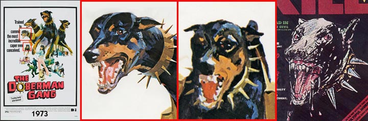
It's a guess and of course I could be way wrong, but it looks surprisingly close. I don't know if this has been previously covered here or elsewhere(?)
HAB1 - R13
_________________
Gosh, you've really got some nice toys here . . .
Last edited by Replicant 13 on Sat Oct 27, 2012 4:30 pm; edited 4 times in total |
|
| Back to top |
|
|
|
|
|
|
|
|
|
|
|
| Author |
Message |
joberg
Community Member
Joined: 06 Oct 2008
Posts: 9447
|
| Posted: Wed Aug 24, 2011 7:42 am Post subject: |
|
|
| I think it's an excellent find...(love the B-movie posters of the '60s and '70s btw) Very possible, as you'd mentioned, that due to the constraint of production, Southwell did a "cut and paste" of material he either knew or researched |
|
| Back to top |
|
|
|
|
|
|
|
|
|
|
|
| Author |
Message |
Replicant 13
Community Member
Joined: 18 Jul 2011
Posts: 912
Location: OffWorld Park, USNA
|
| Posted: Wed Aug 24, 2011 9:29 am Post subject: The Hunt |
|
|
Thanks, joberg!
It's been said several ways. I recall Spock stating it in an old Trek episode, "You may find that having is not so pleasing a thing, . . . as wanting."
I DO find the hunt at least as interesting as finding these "gems". Right or wrong, they help to achieve a goal here. However obsessive it may seem.
Of course, as Skin Job 66 referenced in an earlier post, some discoveries can seem rather obvious once found. It is a great graphics history lesson.
Thanks again - R13
_________________
Gosh, you've really got some nice toys here . . . |
|
| Back to top |
|
|
|
|
|
|
|
|
|
|
|
| Author |
Message |
SKIN JOB 66
Community Member
Joined: 16 Jan 2008
Posts: 2724
Location: FRANCE
|
| Posted: Wed Aug 24, 2011 3:50 pm Post subject: |
|
|
Great work Rep13, the dog head looks spot on !!!

Fred
_________________
THE FUTURE IS A THING OF THE PAST |
|
| Back to top |
|
|
|
|
|
|
|
|
|
|
|
| Author |
Message |
joberg
Community Member
Joined: 06 Oct 2008
Posts: 9447
|
| Posted: Wed Aug 24, 2011 4:21 pm Post subject: |
|
|
Of course the hunt is way more interesting...you're right on that level.
When I see the DVD and the behind-the-scene, I'm amazed at how much those guys from the Art Dept. produced to make that world believable.
Logos, fonts, designs for the different levels, insignas, etc...crazy work for sure and subjected to changes of course, since Ridley knows a thing or two about design and drawings  |
|
| Back to top |
|
|
|
|
|
|
|
|
|
|
|
| Author |
Message |
Replicant 13
Community Member
Joined: 18 Jul 2011
Posts: 912
Location: OffWorld Park, USNA
|
| Posted: Wed Aug 24, 2011 7:10 pm Post subject: The hunt continues . . . |
|
|
66 - Someone (T.S.?) obviously redrew it, but I would be surprised if the poster wasn't the source for the KILL illustration - that or a similar still from the film, or the same source photo. Just a lucky find.
Joberg - I checked out your suggestions for 'Fat Boy'. Nothing yet. The style also reminds me a great deal of the illustrations done for the original "Alice in Wonderland" story, but since line illustration was the standard for print back then, it's a given that there were hundreds of artists whose styles fall/fell into that category. I still thinks it's from a clipart book. Perhaps the flowers were an add-on.
It would be great to have a conversation with Tom Southwell. Although I'm sure he sees this as just one job from the distant past, and may not recall the minute details, he must be aware of our interests in his work - certainly the film's impact.
Thanks for the continued interest. More to come. - R13
_________________
Gosh, you've really got some nice toys here . . . |
|
| Back to top |
|
|
|
|
|
|
|
|
|
|
|
| Author |
Message |
andy
Community Guide

Joined: 01 Nov 2006
Posts: 6237
Location: Rochester, NY
|
| Posted: Wed Aug 24, 2011 7:23 pm Post subject: |
|
|
I seem to recall Tom Southwell saying that he drew the Doberman Kill dog himself, and it was made from his original sketch, and not redrawn IIRC. Also spinner44.com has in the past contacted Tom Southwell himself and spoken to him. It might be worth asking him if he can help.
Andy |
|
| Back to top |
|
|
|
|
|
|
|
|
|
|
|
| Author |
Message |
Replicant 13
Community Member
Joined: 18 Jul 2011
Posts: 912
Location: OffWorld Park, USNA
|
| Posted: Wed Aug 24, 2011 7:41 pm Post subject: Southwell |
|
|
Thanks Andy. I've no doubt it could well be one of Southwell's. I just didn't recall seeing his boxed signature on that cover, as shown on some of the others (ZORD and MONI, in particular). It is not my intention to discount his considerable contributions in any way. Just curious.
Thanks for the lead. - R13
_________________
Gosh, you've really got some nice toys here . . . |
|
| Back to top |
|
|
|
|
|
|
|
|
|
|
|
| Author |
Message |
joberg
Community Member
Joined: 06 Oct 2008
Posts: 9447
|
| Posted: Thu Aug 25, 2011 6:00 am Post subject: |
|
|
| Tom Southwell is on Facebook if I'm not mistaken...or can be contacted via IMDB Pro. |
|
| Back to top |
|
|
|
|
|
|
|
|
|
|
|
| Author |
Message |
Replicant 13
Community Member
Joined: 18 Jul 2011
Posts: 912
Location: OffWorld Park, USNA
|
| Posted: Thu Aug 25, 2011 10:12 pm Post subject: |
|
|
Thanks. Can't afford the Pro. Perhaps FaceBook.
Meanwhile, here's something to chew on . . . : )
- R13
_________________
Gosh, you've really got some nice toys here . . .
Last edited by Replicant 13 on Sun Jul 06, 2014 12:34 pm; edited 2 times in total |
|
| Back to top |
|
|
|
|
|
|
|
|
|
|
|
| Author |
Message |
joberg
Community Member
Joined: 06 Oct 2008
Posts: 9447
|
| Posted: Fri Aug 26, 2011 8:04 am Post subject: |
|
|
| Like it a lot! Where did you get the pic of the gun (seems that I saw it in here)...As for Facebook, it's funny but the picture on his page is of him in the early '70s: long hair, no beard (as we've seen him on the behind-the-scene DVD )...quite funny actually. |
|
| Back to top |
|
|
|
|
|
|
|
|
|
|
|
| Author |
Message |
Replicant 13
Community Member
Joined: 18 Jul 2011
Posts: 912
Location: OffWorld Park, USNA
|
| Posted: Fri Aug 26, 2011 1:48 pm Post subject: The Pic |
|
|
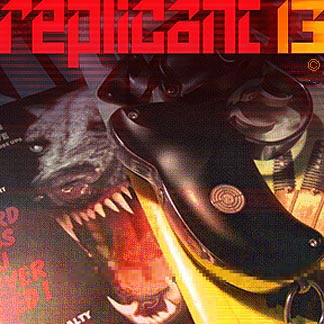
No doubt others have taken similar pictures of their collections and posted them here, but this is a new pic that I took. The blaster is a snub from Hartford (Japan). Of course the magazines are my "updated" interpretations - mock-ups of the covers that I've been working on over the past couple of years . . .
More to come. Glad you liked it!
Later - R13
_________________
Gosh, you've really got some nice toys here . . .
Last edited by Replicant 13 on Sat Jun 02, 2012 12:38 pm; edited 1 time in total |
|
| Back to top |
|
|
|
|
|
|
|
|
|
|
|
| Author |
Message |
Replicant 13
Community Member
Joined: 18 Jul 2011
Posts: 912
Location: OffWorld Park, USNA
|
| Posted: Fri Aug 26, 2011 9:21 pm Post subject: For Your Considerations |
|
|
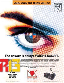
An advertisement for Voight-Kampff Technologies.
HAB1 - R13
_________________
Gosh, you've really got some nice toys here . . .
Last edited by Replicant 13 on Tue Oct 25, 2011 1:12 am; edited 5 times in total |
|
| Back to top |
|
|
|
|
|
|
|
|
|
|
|
| Author |
Message |
Replicant 13
Community Member
Joined: 18 Jul 2011
Posts: 912
Location: OffWorld Park, USNA
|
| Posted: Sat Aug 27, 2011 3:02 pm Post subject: Creative Evolution |
|
|
CREATIVE EVOLUTION (A New Interpretation)
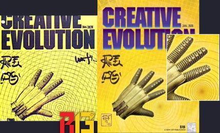
I don't think anyone has ever bothered to tackle this one. Although it is referenced on occasion, there seems to be little interest. I am unsure if it was ever even used on set, but I decided to include it in my list of covers to update, with a new rendering of the glove.
I think any background history on this cover would be interesting.
- R13
_________________
Gosh, you've really got some nice toys here . . .
Last edited by Replicant 13 on Tue Oct 25, 2011 1:12 am; edited 4 times in total |
|
| Back to top |
|
|
|
|
|
|
|
|
|
|
|
|
You cannot post new topics in this forum
You cannot reply to topics in this forum
You cannot edit your posts in this forum
You cannot delete your posts in this forum
You cannot vote in polls in this forum
|
|
|
|
|
|
|
|